Frontier
Speed Upgrades
Feature
Enabling customers to upgrade their own internet speed plan at any time.
Users
Current Frontier fiber internet customers.
Benefit
Increased sales and engagement, reduced call volume
My role
Content designer collaborating with UX designer and researcher.
Timeline
2023 - 2024
Summary
Internet customers typically have to call their provider to upgrade their internet plan, but Frontier wanted to empower customers to do this on their own time. Making internet plan upgrades a new self-service feature would allow customers to compare plans, select an upgrade, and place their order in just a few clicks, resulting in more fiber sales for Frontier.
Goal
The project aimed to increase fiber internet sales, increase customer satisfaction through self-service, increase digital containment, web and app engagement, and reduce sales calls.
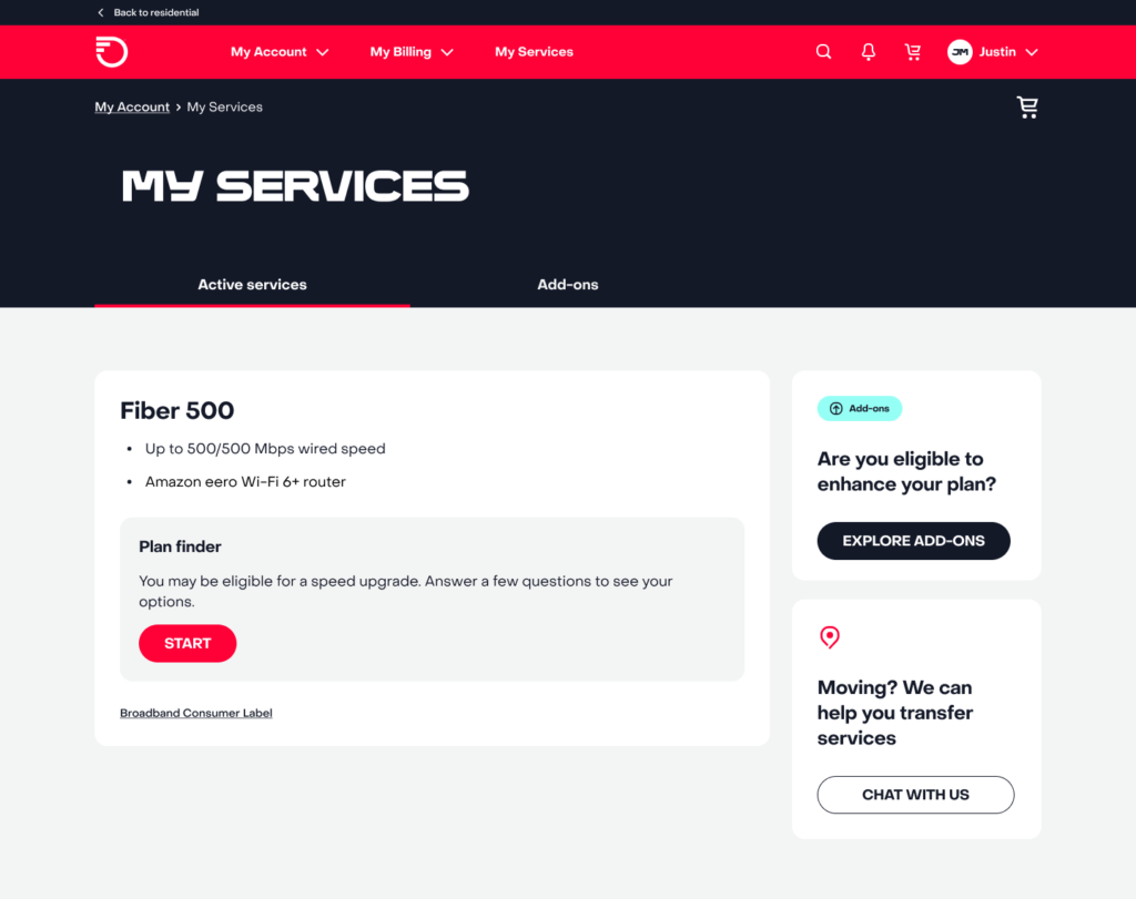
We developed a prominent entry point within a customer's existing fiber plan information. A plan-finder questionnaire piqued users’ curiosity, enabled engagement and a natural transition into the sales flow.

Challenge
There were several awareness and technical challenges when introducing a self-service internet speed upgrade feature. Many customers were unfamiliar with their current plan’s limitations or the benefits of upgrading, and they were accustomed to calling an agent to make changes. This shift to self-service required clear guidance and a frictionless experience to encourage adoption.
Key obstacles included:
- Technical limitations: API and backend delays created long wait times during crucial moments in the experience, increasing the risk of user drop-off. We needed to mitigate this through thoughtful content design and UX solutions that reassured users and kept them engaged.
- Awareness and education: Customers had to be introduced to the upgrade feature and guided through their options with concise, digestible content—providing enough details to support an informed decision without overwhelming them.
- Decision paralysis: With multiple plans to choose from, users needed a clear and structured way to compare options without feeling lost or confused.
- Price transparency: Customers often hesitated to upgrade due to concerns about pricing and hidden fees. We had to ensure that billing details were surfaced clearly so users felt confident moving forward.
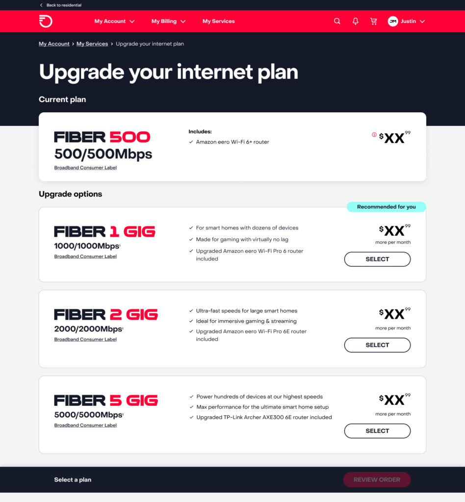
Concise, scannable plan details and pricing allowed customers to quickly compare the value between each option, decreasing the cognitive load for decision making.

Solution
To create a seamless and intuitive plan upgrade experience, we developed a stacked card design that allowed customers to compare plans side by side in a structured and scannable format, and validated this through user testing. By prioritizing clarity, hierarchy, and minimal cognitive load, we ensured that customers could make confident decisions quickly. A few highlights of my content include:
- Prominent entry from current plan details: Customers could initiate an upgrade journey directly from their current plan details, ensuring a natural and contextual entry point that reduced friction and improved discoverability. By clearly displaying the existing plan alongside available upgrades, we made it easy for customers to compare value at a glance.
- Plan finder questionnaire: To assist customers in selecting the right plan for their needs, we introduced a brief, interactive questionnaire that guided them based on factors like household size, device usage, and streaming or gaming habits. This approach helped demystify technical jargon and provided tailored recommendations, reducing choice paralysis.
- Scannable plan details: Each plan was presented with concise, scannable bullet points highlighting key features such as speed, price, router, and a brief description of what kind of user the plan accommodates. This format catered to both quick decision-makers and detail-oriented users, ensuring all necessary information was readily accessible without overwhelming the interface.
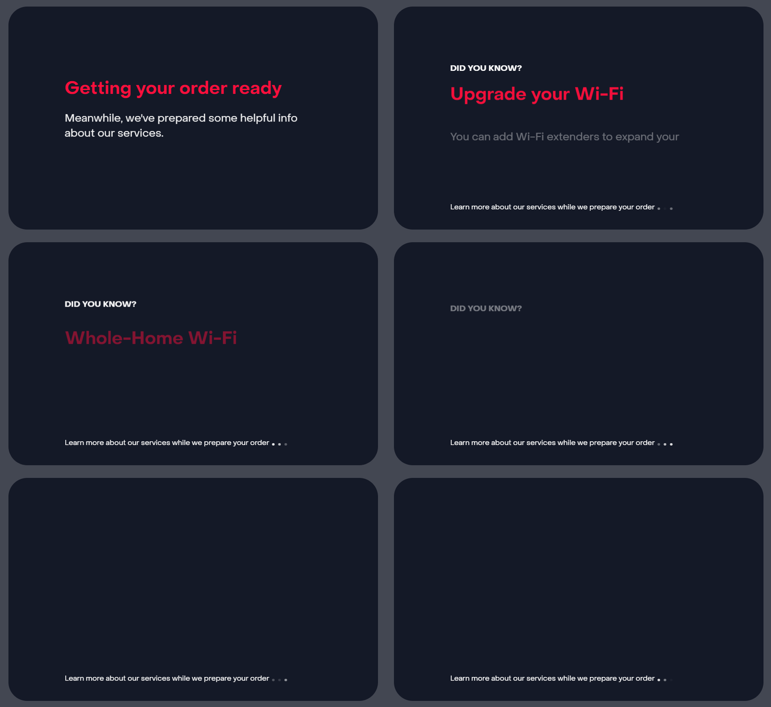
- Educational loader content: During system load time before checkout, I designed engaging and informative content to keep customers engaged while they waited. This included tips on Wi-Fi optimization, plan add-ons, billing transparency, and troubleshooting common issues, transforming passive wait time into a valuable learning opportunity. By surfacing this content strategically, we helped mitigate cart abandonment.
Making wait time useful—while the system processes the upgrade, customers get helpful tips on Wi-Fi optimization, plan add-ons, and billing insights. This keeps users engaged and adds value to the experience, turning downtime into learning time.

Results
Speed upgrade orders
Orders increased by 20% and self-service became the leading sales channel in two months.
Increased revenue
Self-service speed upgrades generated $570k+ revenue within 9 months.
Increased engagement
Web and mobile app engagement increased as users sought self-service.
Agent assistance
Phone and chat agent assistance decreased as users ordered their own speed upgrades.
Reflection
The project emphasized the value of ongoing improvements and adaptability in self-service experience design, as well as highlighted the need for post-launch iteration. After launch, new data and customer behaviors surfaced, revealing additional opportunities to refine content, optimize the upgrade flow, and address edge cases we hadn’t initially anticipated. We’ve revisited this project to conduct testing, implement promotional offers, and work is ongoing in 2025 for further improvements.