Frontier
Registration Redesign
Project Snapshot:
- Users: New and existing Frontier customers
- Feature: Simplified and more secure registration experience
- Benefit: Customers save time when registering and get better access to their services.
Goal
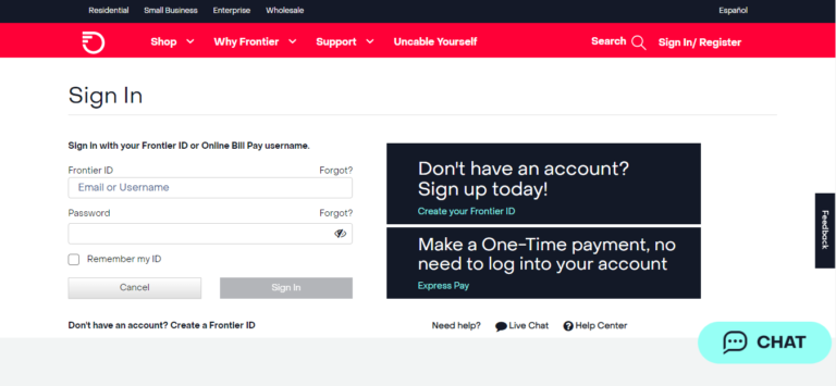
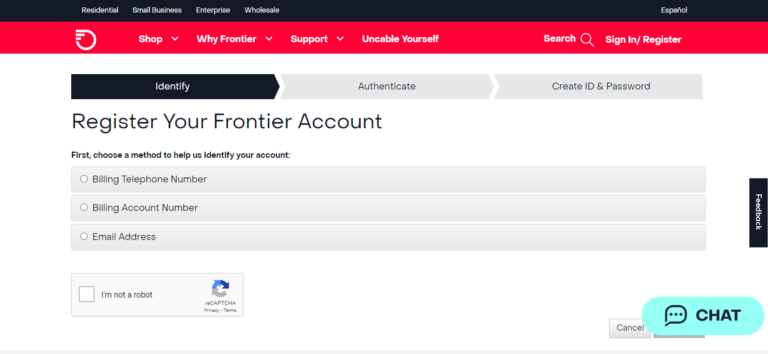
The project aimed to address significant problems with our registration experience, which was causing 8,500 monthly calls, a 17% registration completion rate, and a 62% account creation rate, and to design an experience reflective of the Frontier brand.
Challenge
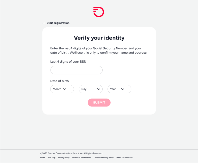
The new registration experience needed to increase account creation, contact info verification, web and mobile logins, and reduce customer calls. The project also sought to introduce and justify new security checks to address the 90% rate of unverified user emails and phone numbers.
Solution
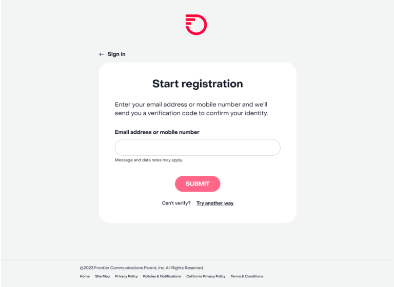
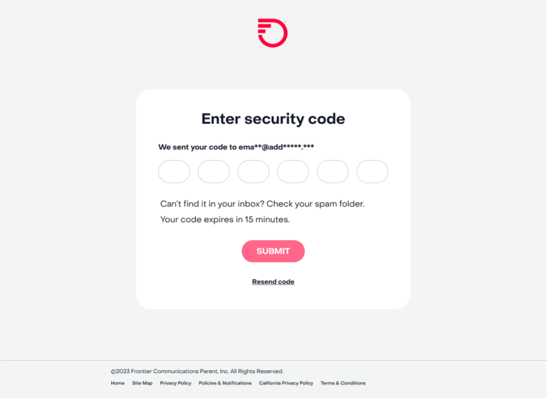
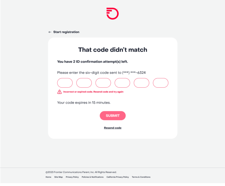
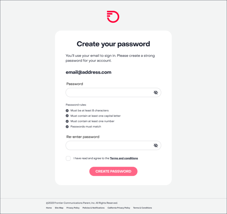
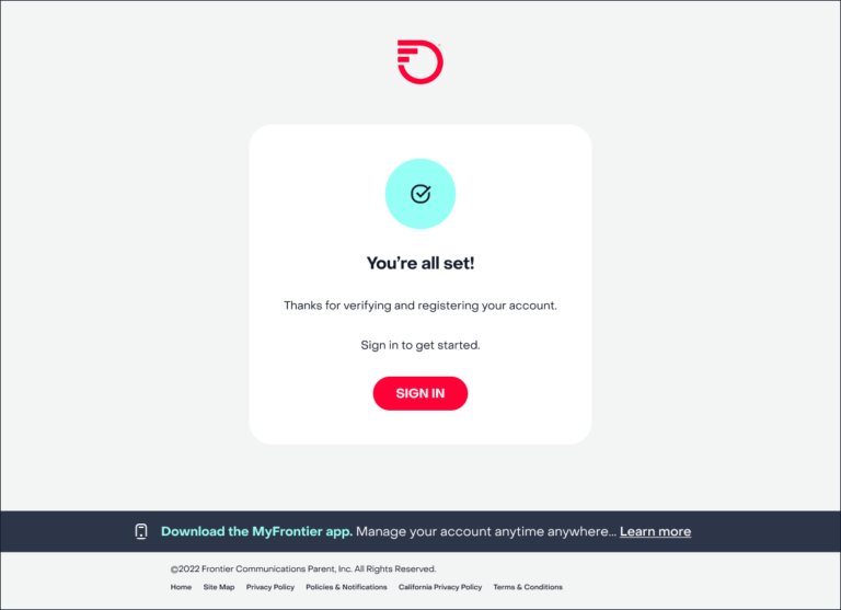
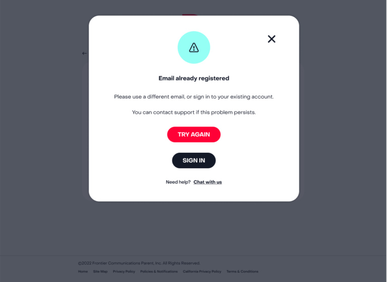
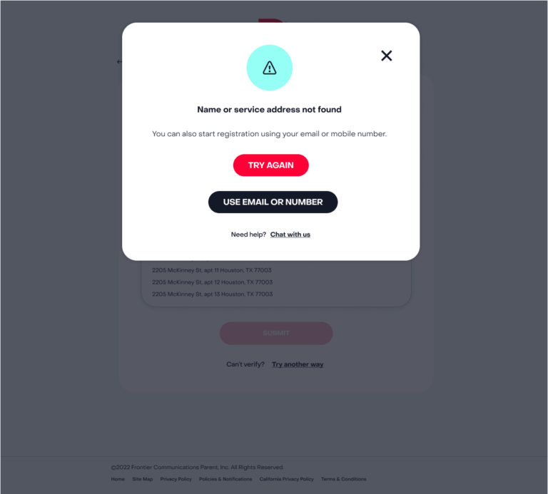
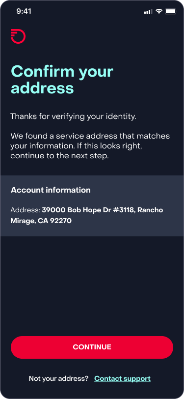
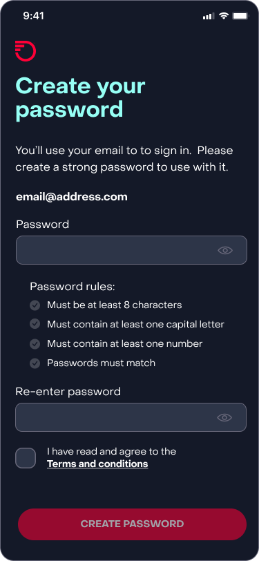
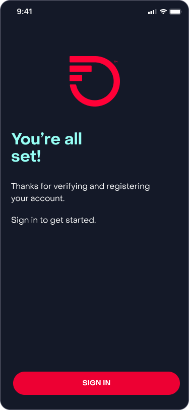
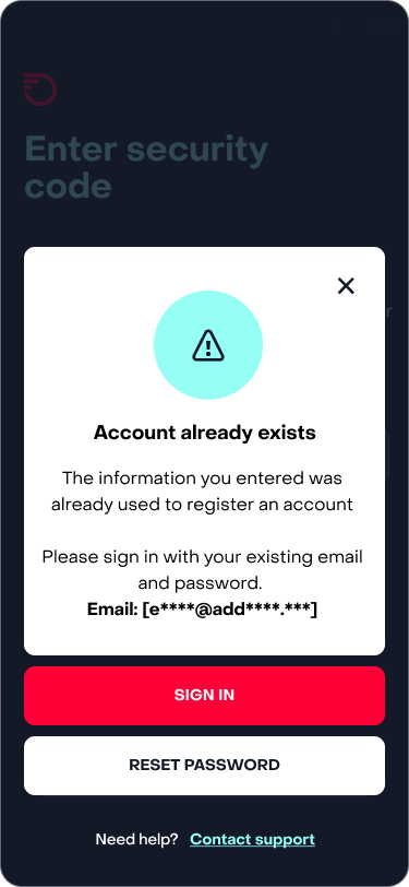
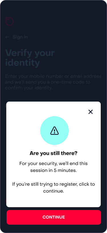
I used clear and concise microcopy to guide customers through a friendlier registration process. We designed multiple tested iterations to address user pain points, business goals and help bring the experience on brand.
Results
The new experience contributed to month-over-month increases of up to 8% in account registrations, 15% in unique app logins, and 2% in web logins. This shift in user behavior highlights the value of my UX writing in creating intuitive experiences.
Reflection
Our work didn’t stop with deployment. We followed the project to identify further pain points and opportunities and made enhancements in the coming months.
