Frontier
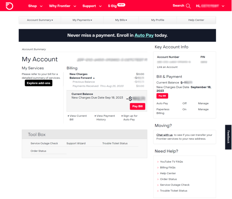
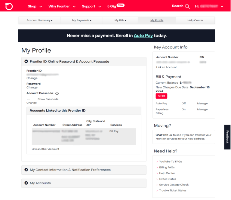
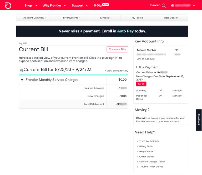
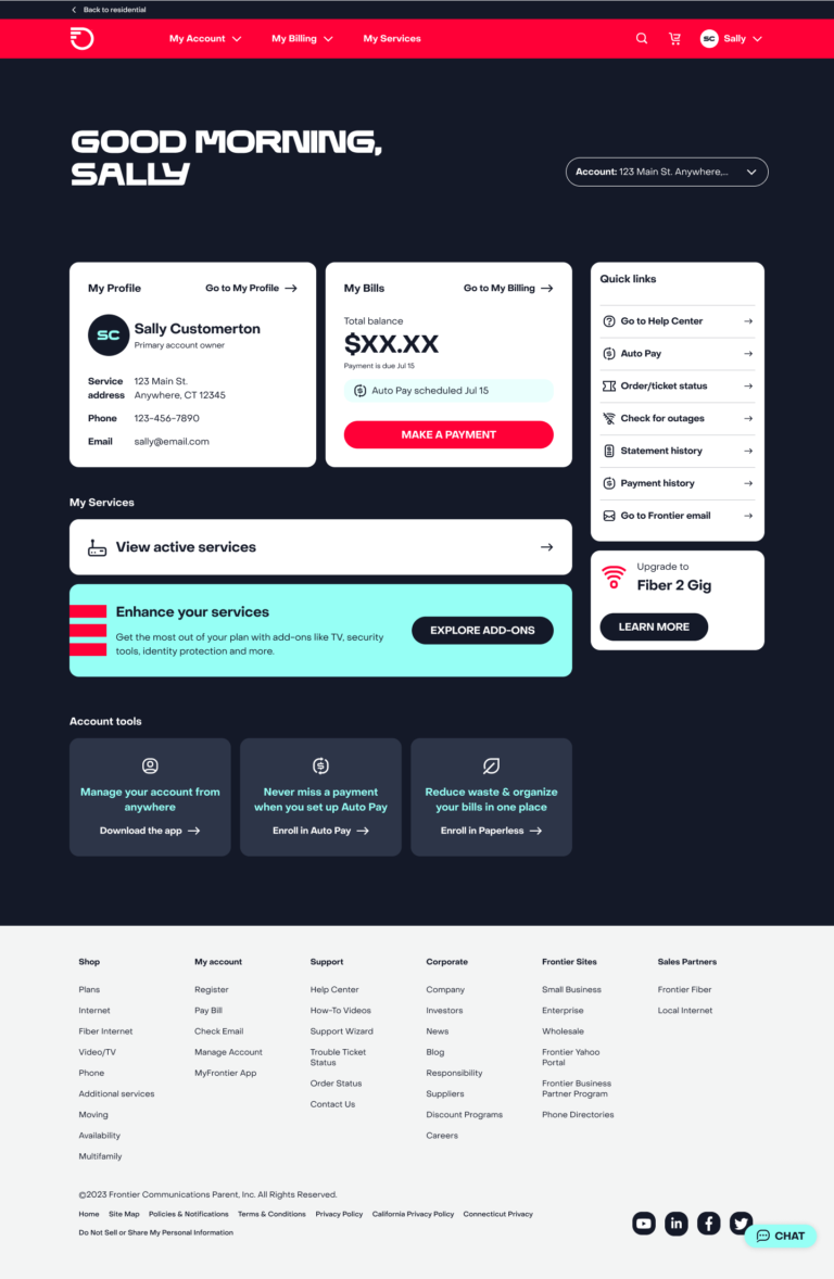
Account Redesign
Project Snapshot:
- Users: Frontier customers
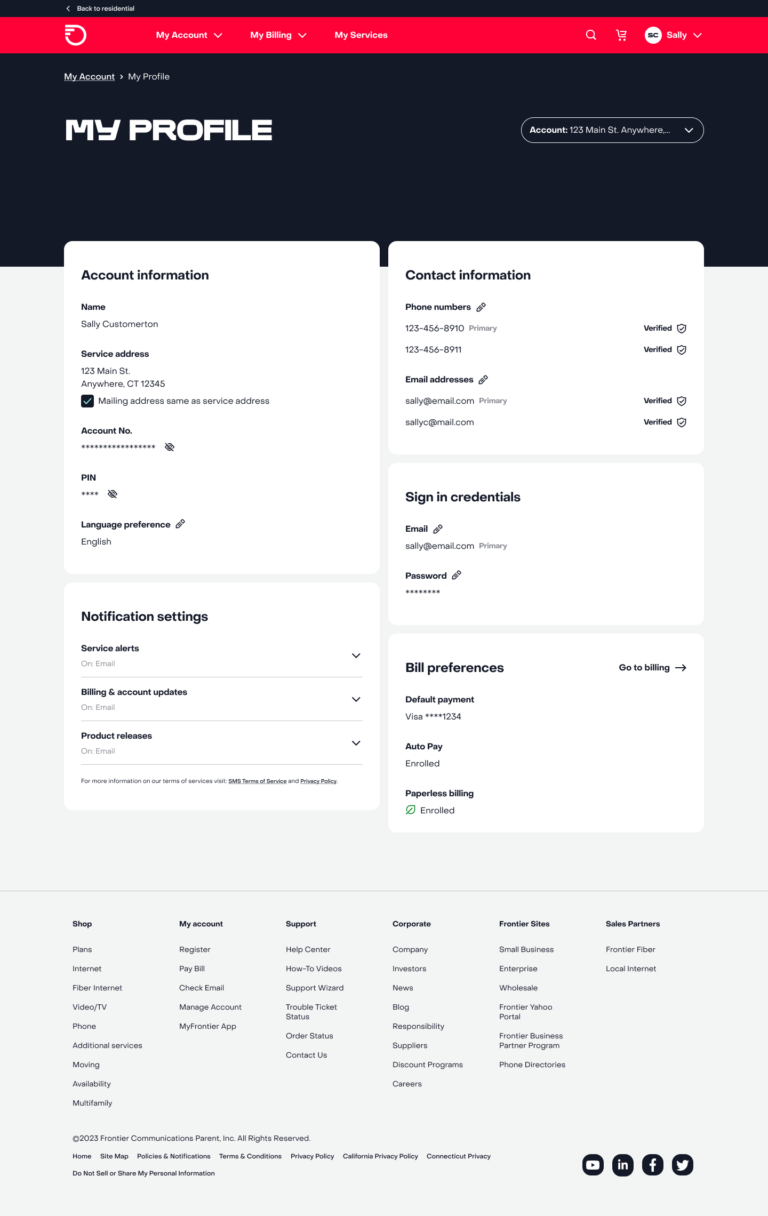
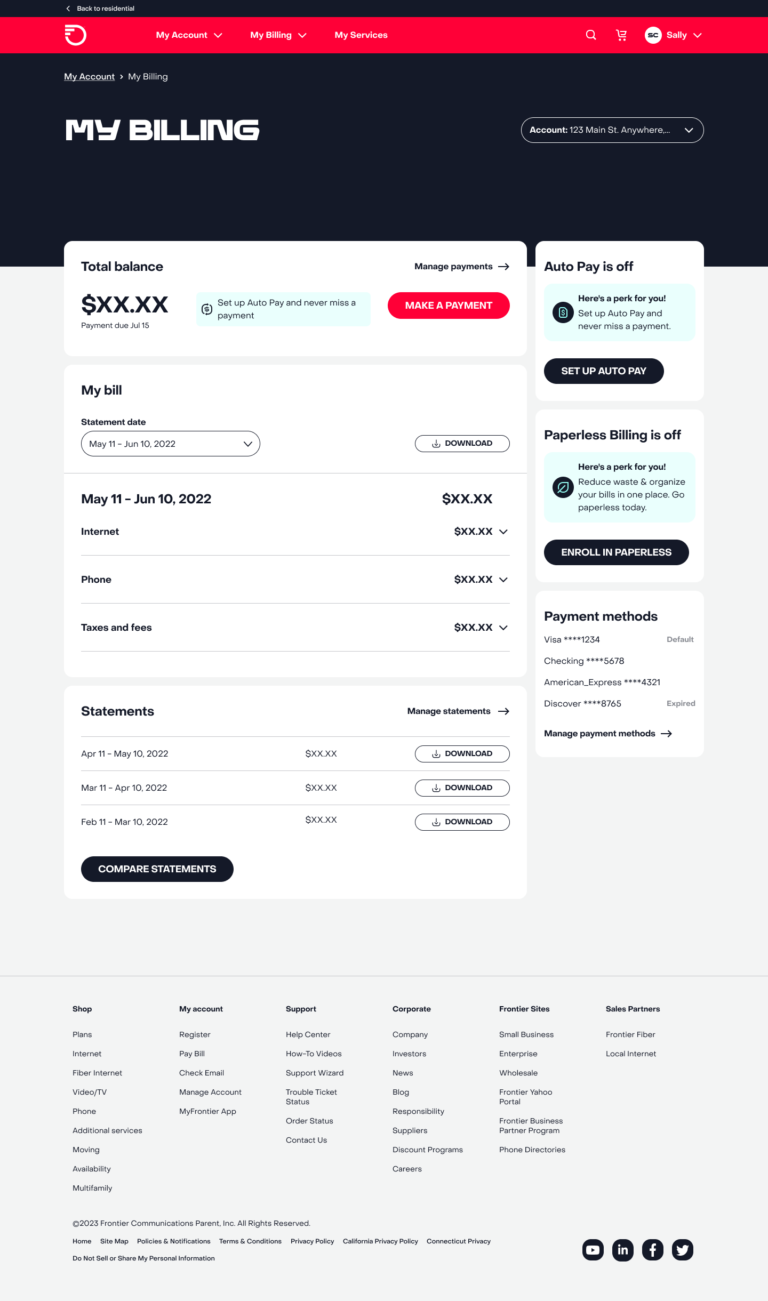
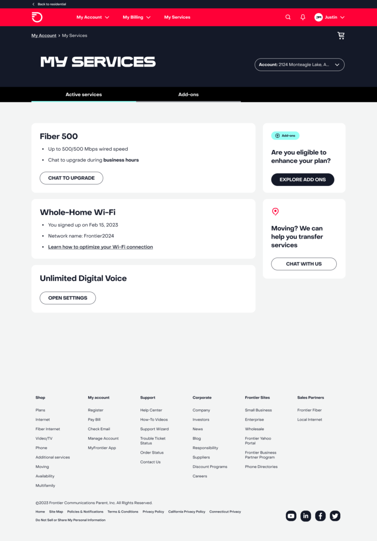
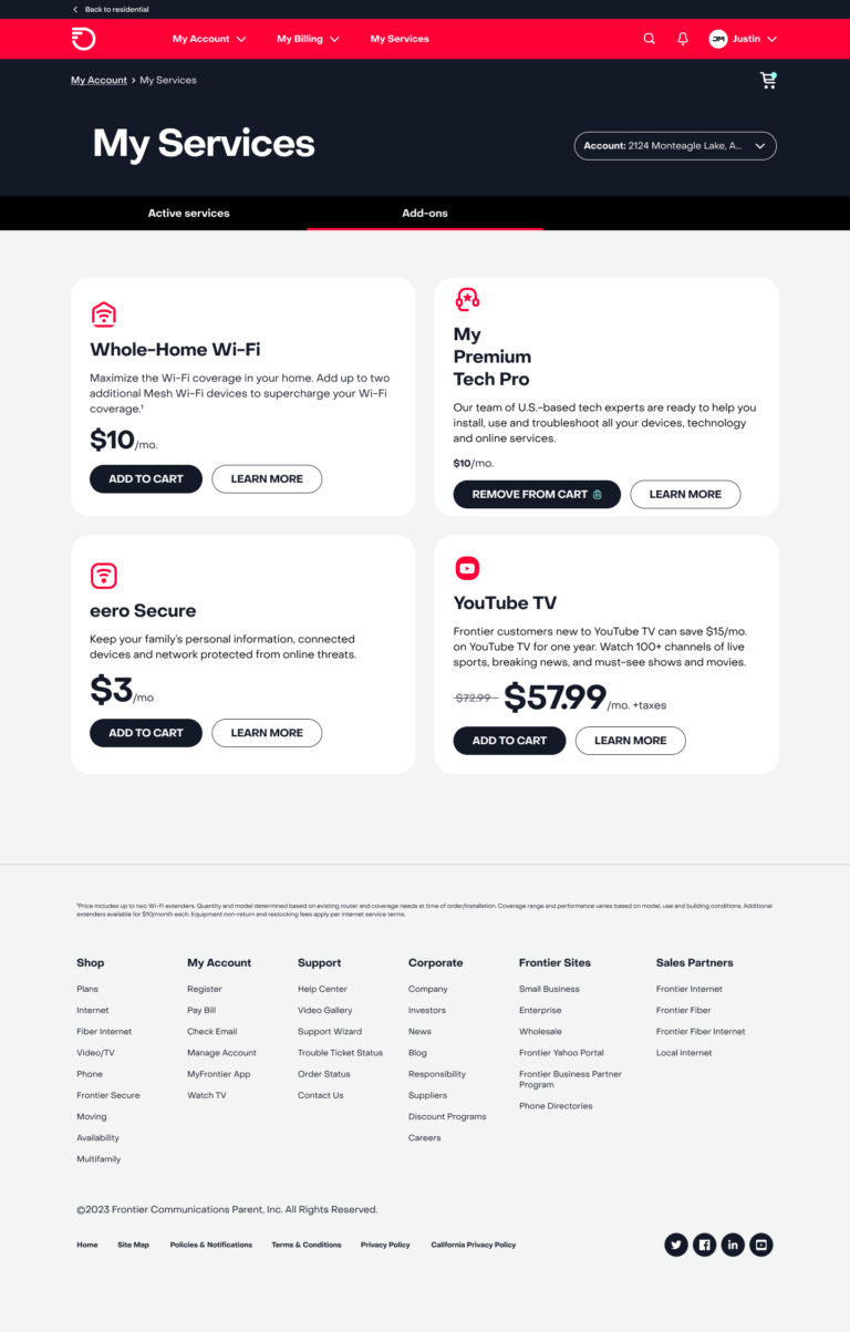
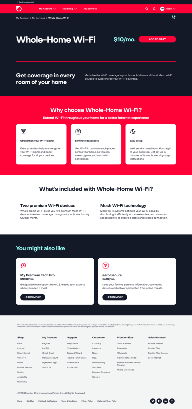
- Feature: Simplified UI, new self-service options, promos and upsells.
- Benefit: Customers can better manage their services and spend less time calling support.
Goal
The project aimed to increase account logins and reduce calls by enabling easier navigation, more digital features, and self-service options in a revamped account experience aligned with Frontier’s new digital-first strategy.
Challenge
We needed to introduce new features while reducing screens to create a more concise and intuitive experience without becoming crowded and overwhelming.
Solution
I emphasized clear and concise UX writing throughout the design to guide users through their new accounts, help them navigate to key information, and empower them with a simple self-service experience.
Results
The new experience contributed to increased web logins monthly, a 10% increase in bill pay completion, and 85% digital user containment. The self-service portion also yielded up to a 5% increase in conversion rate, reduced abandonment and exit rates, and doubled time spent on the page.
Reflection
The project demonstrates the impact of UX on customer experience, loyalty, and sales, as well as my effectiveness in shaping experiences that align with company goals.
