Adeptus Health website redesign
Date: March-July 2018
Team: Project manager (external), developer (external), writer/editor (external), 6 Adeptus stakeholders, 1 subject matter expert (external).
My Role: I was the sole writer and editor throughout the project, and not part of the internal Adeptus team. I also contributed to visual design.
Objective: Adeptus Health, the largest developer and operator of satellite emergency departments in the U.S., restructured and needed a new website to reflect and communicate its new strategy.
Skills Used: Writing, editing, project management, cross-team collaboration, microcopy, style guidelines development, user experience design and writing.
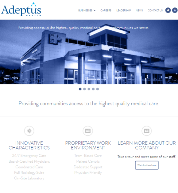
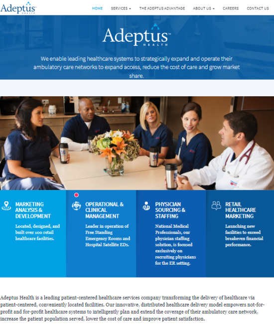
Problem: Although Adeptus had established a brand voice, it hadn’t established a style. As a result, its value propositions were unclear, and key terms used inconsistently. For example, I identified 6 different terms Adeptus used to describe the same product.
Challenges: Stakeholder availability, different visions, and inconsistent language were some of the biggest challenges affecting the project.
Additionally, being an external member of the project meant I had limited control and ownership of content, and no continued involvement for user testing and updates after its release.
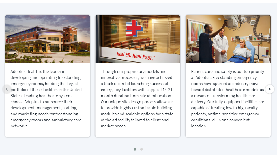
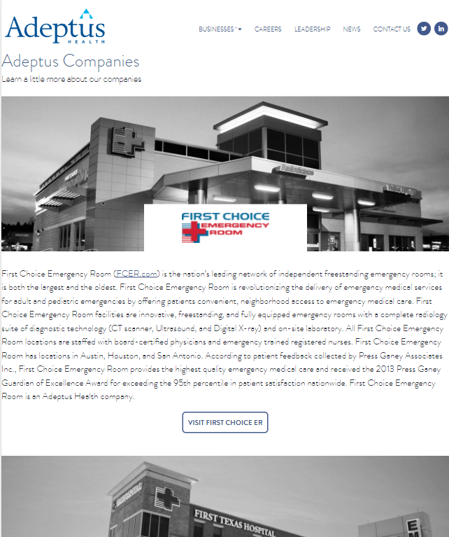
Solutions: Our website revamp focused on new user-focused key phrases. For example, we focused on the “patient satisfaction” phrase to communicate product outcomes to users (business partners). We also highlighted Adeptus’s proven results, which were previously only available as internal materials. Showcasing the data was essential to communicate value to the users and to establish brand trust.
Individual Contributions: One of my contributions was helping establish Adeptus’s style. After communicating the importance of key term consistency and style to the stakeholders, I led them to agree on one key term to describe their product instead of the 6 terms they previously used.
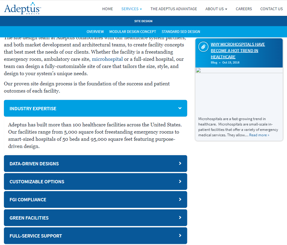
Another contribution was enhancing user experience by proposing accordion menus that allowed users to open/expand more information on a page that otherwise would have been crowded.
Process: I first audited the existing Adeptus website to assess the content and style before speaking to stakeholders. I prepared initial questions, such as: Who is the user? What do you like and dislike about the content? What are our goals? What are the most important points we need to communicate?
An initial planning interview established the project plan, major expectations and objectives, scope and timeline. Adeptus provided market and user research, and internal data and materials.
Stakeholder interviews revealed answers and insights to shape our revision strategy, and enabled brainstorming user experience and content ideas.
I wrote first drafts for all of the website pages, which were then reviewed by project manager and applied into developer mockups before stakeholder review. After stakeholder review, any necessary edits and follow-up reviews took place.
Further thoughts
The Adeptus team was satisfied with the results and stakeholders agreed the new design improved user experience. The project was finished well before the expected timeline and exceeded Adeptus stakeholders’ expectations.
As an external member on the project, I did not have access to the data needed for measurable outcomes. Although I wasn’t a part of Adeptus’s continued journey, here’s what I would’ve wanted to see after the launch of the website to continue improving the user experience:
- I would’ve evaluated website analytics to track the user journey through the site, identify possible logjams via time spent on pages, and determine the most versus least visited areas for further review.
- I would’ve explored direct user feedback to identify pain points, thoughts on design, key terms, and other components. These insights would inform future changes.
- I would’ve created a style guide to clearly define voice and style to preserve consistency in future projects.